Senior Designer | Creative Direction

Tanqueray

Defining the visual direction

Tanqueray No. Ten is a premium gin crafted by Charles Tanqueray & Co., renowned for its exceptional quality and vibrant flavor.

I played a key role in supporting establishing a new digital visual direction for Tanqueray.com, working close with the Creative Director.

The goal was to create a visual language that is approachable yet premium that elevates the world of cocktail crafting.

Visit website

Role


– Set a new visual direction for Tanqueray.com


– Support Creative Director with the designs to support narrative

Role


– Set a new visual direction for Tanqueray.com

– Support Creative Director with the designs to support narrative

Challenge


– Three days to shape the design in to a more premium direction


– Create a space where all brands can live harmoniously

Challenge


– Three days to shape the design in to a more premium direction


– Create a space where all brands can live harmoniously

Deliverables


– Design concepts

Deliverables


– Design concepts

The process

The process

My process begins with defining the level of premium we want to achieve in alignment with the brand’s values. I then explore photographic direction, experiment with layouts, and shape hero visuals to establish the energy and visual language we want to communicate.

My process always start by understand the level of premium we are trying to achieve that aligns with the brand values. The meaning of premium for you might be different to others.

I start to explore the photography, play with layouts and hero to understand the level of energy that we want to bring visual.


Understand and expand the typography across different levels, how it shows up as headline, subheading, paragraph and captions.

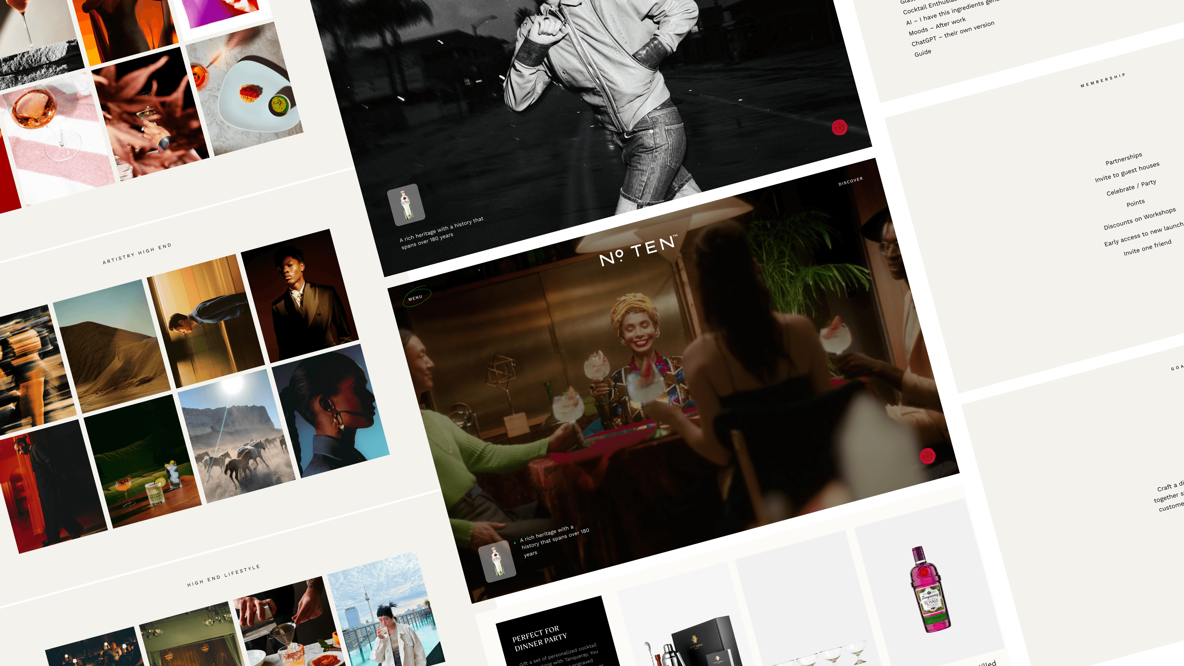
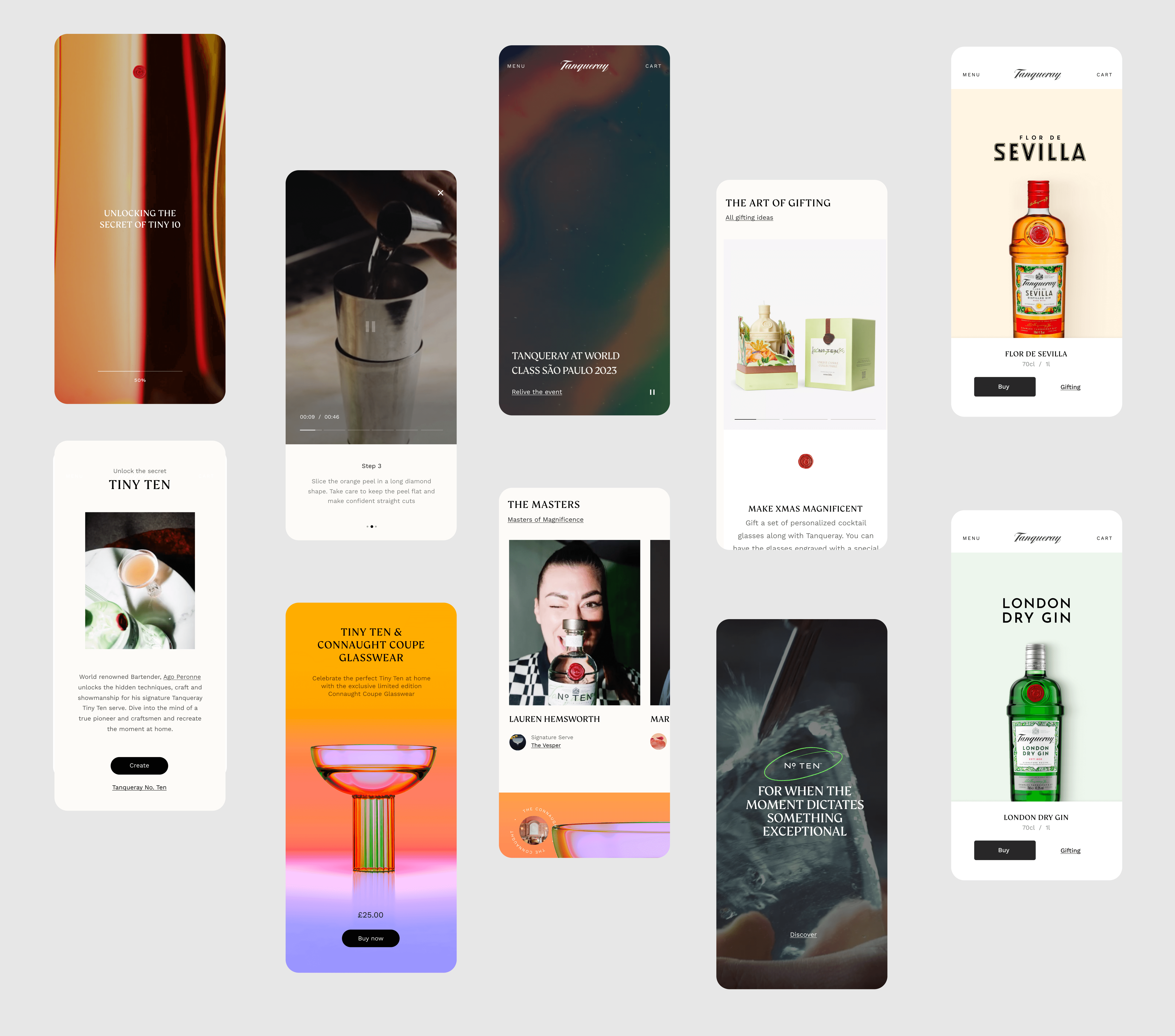
We adopted an editorial approach to elevate their cocktail recipes and bring them to life across every moment of the costumer journey.

A flexible design system created to extend seamlessly across No.10, London Dry, 0.0%, and the wider flavour collection.

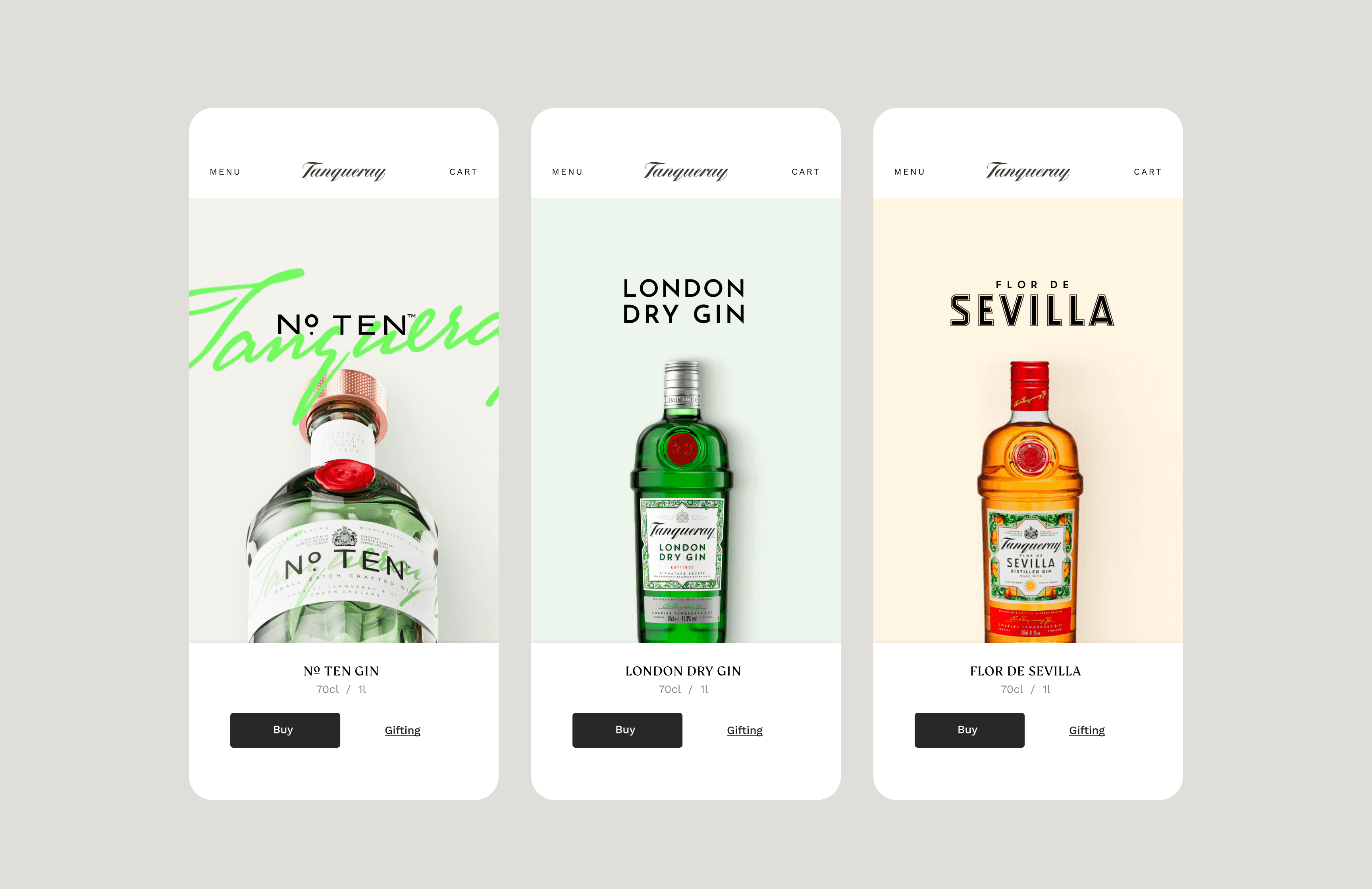
Creating elevated experiences to inspire and enhance the Tanqueray.com journey, from crafting the perfect cocktail to personalized gifting.

Team

David Amorim, Senior UI Designer

David Savage, Creative Director

17:09:08

United Kingdom, London

Listening to: Parcels

©David Amorim | 2026